With more than 10 years of history, BuildASign has a rich and unique brand story. However, very little of this brand was apparent in the e-commerce organization's visual identity. Our challenge was to modernize the BAS visual identity while preserving its existing brand equity. These changes would then inform the design of the new responsive experience.
Logo Design - Tyler Northcutt / UX Implementation - Edward Rendon
PROJECT INPUTS
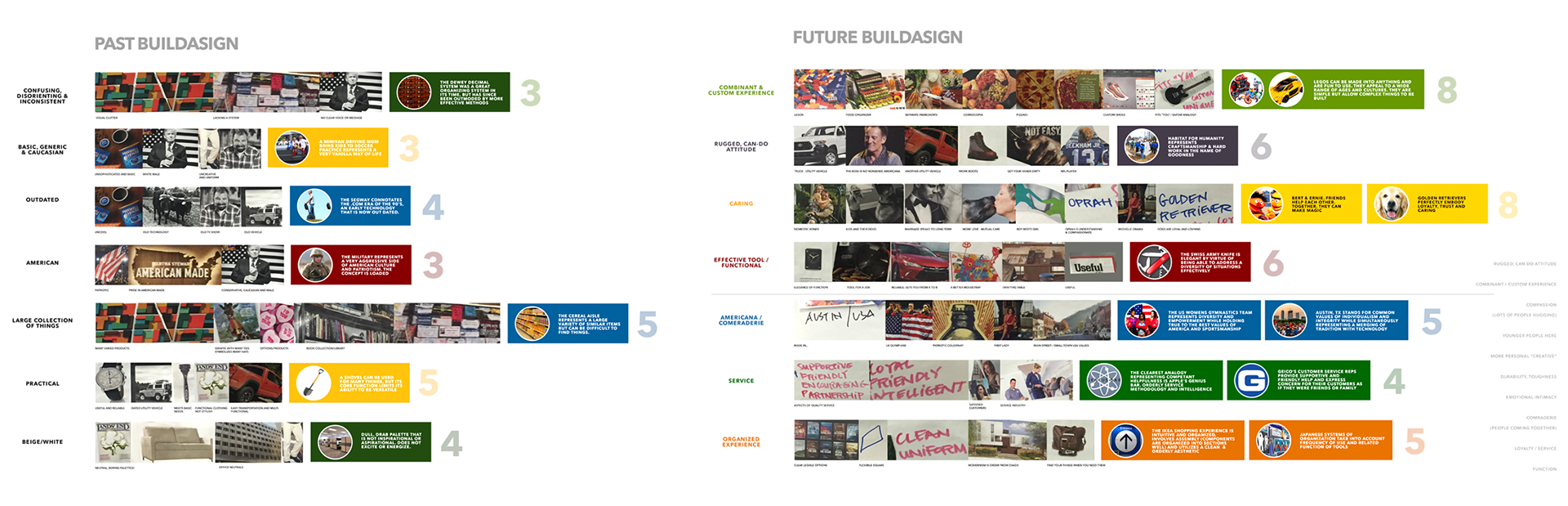
We were able to interview users and ownership as they were defined as key stakeholders early on. The resulting brief identified brand DNA requirements, primary use cases, and the framework for our research into competitive landscape.
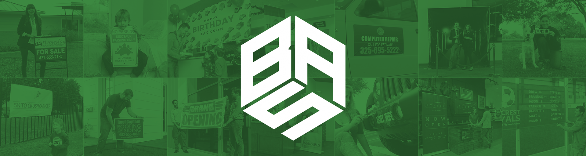
THE MARK
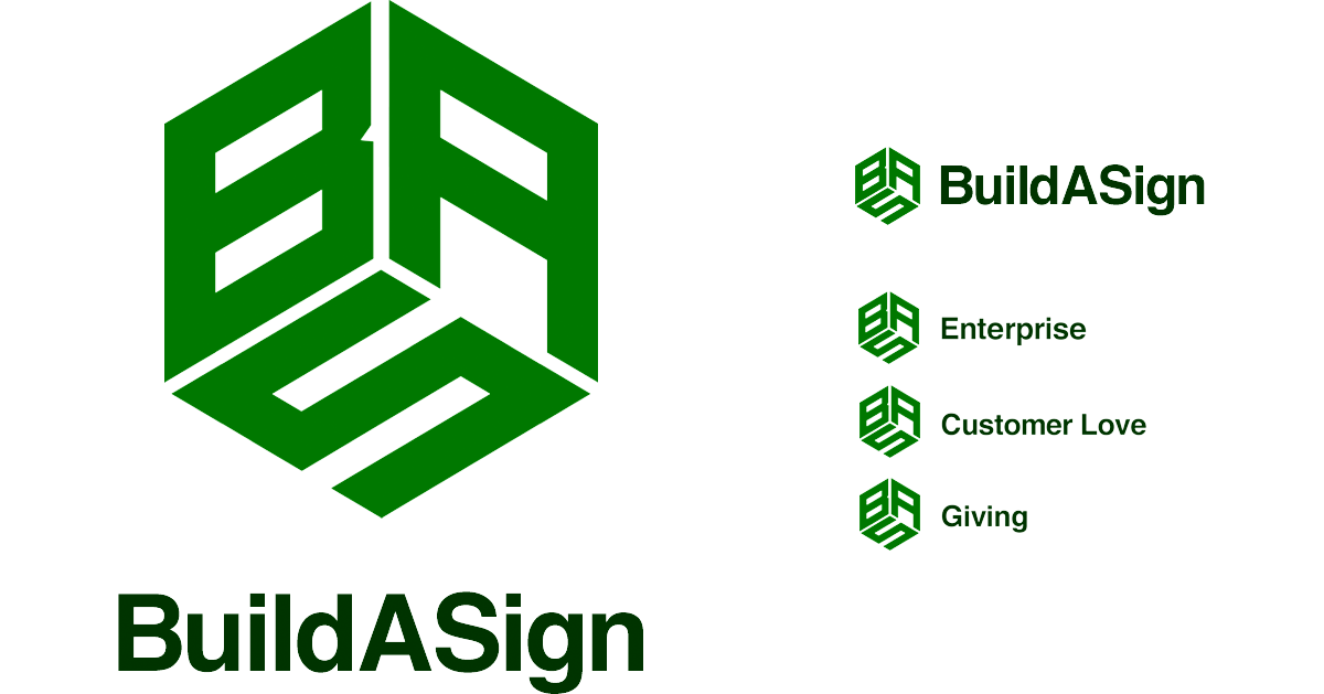
The mark is deployable in multiple configurations and is modular for use in the BAS sub brands. It is highly differentiated within the vertical, and connotes shipping and manufacturing while staying true to the old brand.
SITE BUILDOUT INPUTS & REQUIREMENTS
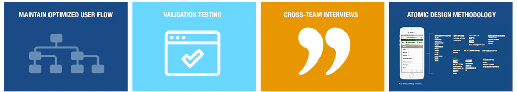
We wanted to maintain our current funnel as it is well optimized. All additions to the information architecture are to be validated through testing. Cross team interviews were conducted in order to create a set of variables for a testing matrix. Team process was shifted to atomic design methodology so pages could iterated upon as efficiently as possible.
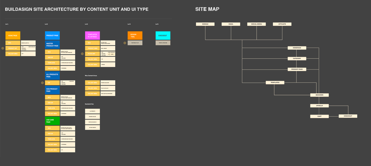
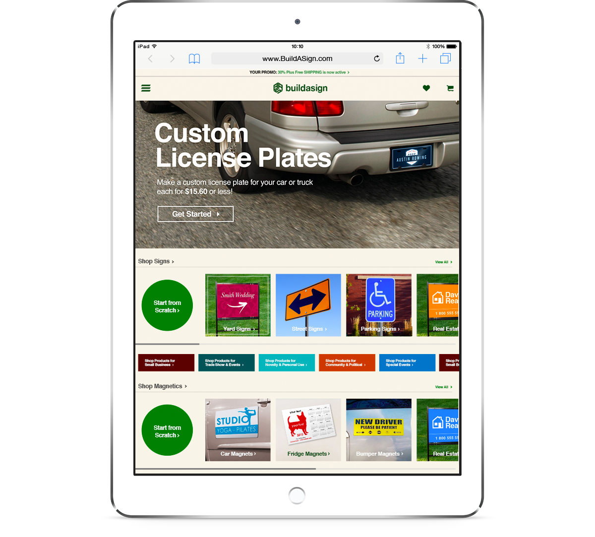
THE SITE

Campaign area imagery rotates between use-case and product-based photography. The new design is meant to echo the existing one, but in a cleaner, more user-centric form. Multivariate testing begins right at launch.
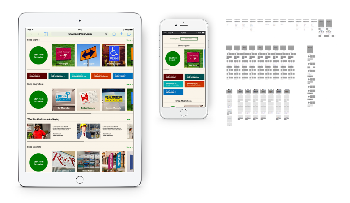
Being properly responsive, the UX supports a 1-to-1 match for all content on mobile and desktop. Touch UX has been built into the design as a key focus.